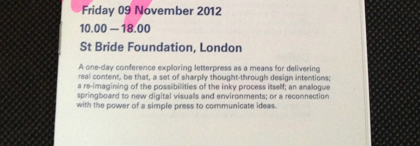
Letterpress: Something to Say
Letterpress is definitely not just retro-nostalgia anymore. This is a quite a statement to make, but in the event ‘Letterpress: Something to say’, held at St. Bride, several clues pointed int that direction: there were not nostalgic printers whimpering for ‘the better times’ of hand composition, nor there were old black and white movies with […]


Side Note: Reasons to love London
0 Comments
Sometimes when I am in Spain people–friends and family mostly–ask me why I do love London, why I keep trying to survive in this city. Many times, honestly, I dont have a proper answer. I dont think there is only one response to this, but many little reasons, and they are hidden in the streets […]
Continue reading