


font ‘window shopping’ in the latin-american spectrum (vol i)
18 Dec 2013
Latin-American and Iberian interest in typography is growing. In the last ten years, the situation for type designers and graphic designers has been transformed in terms of work possibilities, accessibility and exposure. Nowadays designers from all over the Latin-American countries had access to fonts and foundries that before were only for a few privileged ones. Globalisation allows type designers to work from remote locations; and it also means their work could be internationally exposed.
This situation might have many causes: economical development leading to more designers studying abroad (one only need to check the amount of students from Colombia, Spain, Portugal or Brazil in Reading or KABK, for instance); the accessibility provided by the Internet, democratising the process of graphic designers broadening their exposure; affordable books in typography and translations into Spanish meaning more students and designers interested in the topic; the increasing quality information in the Internet about printing and typography; the digital type design industrialisation or commercialisation, companies making real money with digital fonts, not just experimenting for fun; widespread workshops and schools focus on type design, lettering and calligraphy —particularly in the last five years; and many other aspects relate to micro and macro economics I might forget or I might no be aware of.
As a result type design in countries such as Spain, Portugal, Argentina, Brazil or Colombia, has not known such a sweet time before, or in a long time as the case of Spanish typography, that has not been this healthy since the Spanish Golden Age in the Eighteen century. And this is even more obvious after reading Vicente Lamónaca’s book on Latin-American typography, an extensive introduction to the subject, with 42 articles from different authors, with a general agreement that this is a new era for type design in LatinAmerica [Tipografía latinoamericana, compilado por Vicente Lamónaca]
Although I don’t truly believe there is a particular Latin-style in typography, nor a national identity for that matter, we all speak the same language, and that is a perfect starting point to review some interesting foundries. So let’s go and do some font-window-shopping in the LatinAmerican and Iberian foundries.
PS: This does not pretend to be an encyclopaedia of type designers nor a list of foundries or typefaces; but some sketches about Latin and Iberian type designers and their foundries from my own point of view. I will start with Spain, and little by little I will include more type designers/foundries.
PS2: By the time I started writing this article and the time of publishing Jose Scaglione, cofounder of TypeTogether, was elected president of ATypI, and its next edition will be held in Barcelona, organised by Spanish type designers Andreu Balius, Eduardo Manso and Laura Meseguer. No doubt, something is happening in the Spanish-speaking countries.
spain
I would rather say there are two eras in the recent Spanish type design scene. The late 80s and 90s, with designers experimenting with computers and software, and more experimental techniques, (letraset, photocopies, etc), influenced by international designers such as David Carson, Fuse, Emigre… I am thinking of Andreu Balius, Typo-o-Tones (Laura Meseguer, Enric Jardí…) and Eduardo Manso for instance.
And later, in the 2000s, when those experimenting with type became professionals and delicate text typefaces were displayed, along with Spanish revivals from the Eighteen century. And with profesionalization a new generation bloomed, some graduated from Reading and KABK, such as Laura Meseguer, Pilar Cano, Ferrán Mila, Octavio Pardo, others were self-educated, such as Pedro Arilla, Jordi Embodas, Iñigo Jerez…
A new, fresh and healthy generation of type designers eager to evolve as designers, but with a hostile environment: national market, immerse in a catastrophic economical crisis, and lacking the respect for type that exists in England or Germany (in the sense of investing, researching, and, of course paying for fonts).
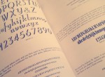
Typerepublic
Designers: Andreu Balius
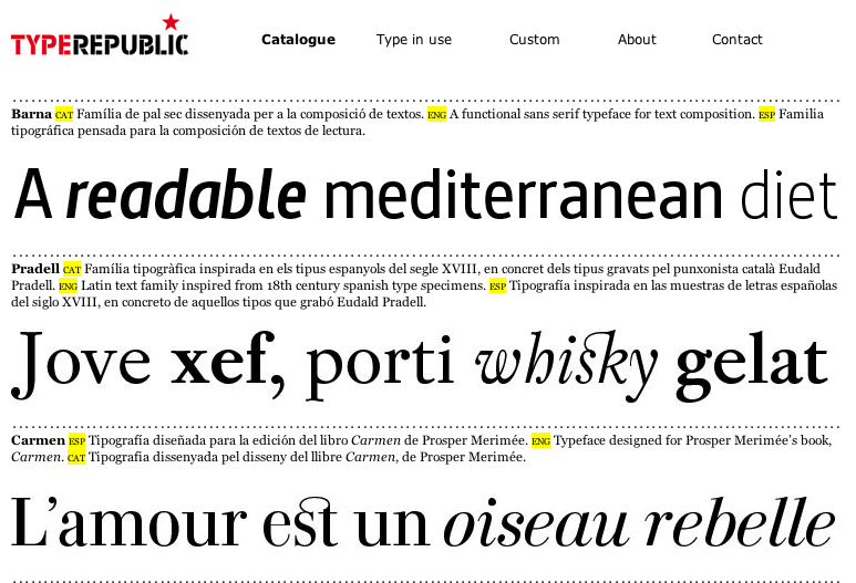
Catalogue: mainly Latin; well balanced between text and display; Spanish revivals…
http://www.typerepublic.com/
Claim: “Typerepublic offers a small selection of exclusive typefaces ready to be used”
Typerepublic is Andreu Balius, and Andreu is probably one of the best Spanish type designers. He has been in the job for several years now, and his career is mainly focus on type design. He lectures –literally– all around the world, offering talks and workshops. He was one of the first Spanish type designer to be interviewed in TypeRadio. Probably his best known type is Pradell, inspired in Spanish punches from the 18th century, and his masterpiece. Recently he released his first non-Latin font, Al-Alandalus, an Arabic multi-script that combines with Pradell, but it has its own features.
Another interesting font is Super Veloz, a system of modules that can be combined almost infinitely, produced in the 40s by Spanish printer Joan Trochut, during the shortage after the Spanish Civil War. In 2004 Andreu digitalised Super Veloz with Alex Trochut, grandson of Joan Trochut and now a renowned lettering artist.
Andreu will organise, with Eduardo Manso and Laura Meseguer, the next AtypI edition in Barcelona.


Feb 25, 2014 @ 11:00:45
Thanks for this article. I love everything about typography and printing.