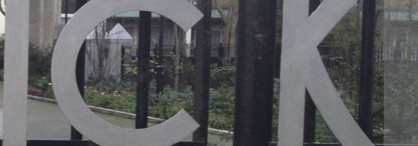
The kerning & the fence
The kerning & the fence it is not a pub, but the typographic problem that the architects Emberton, Franck & Tardre forget to check when the designed the Brunswick Close Estate, in Tompion Street, Islington, London, back in 1956–58. Every time I walk to the grocery store I can see the building front name and […]

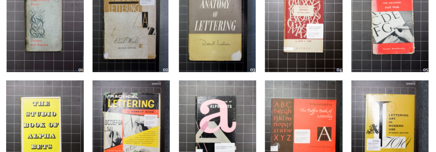


The one in typeface classification
10 Comments
An honest confession. Until recently, I’ve never been truly interested in typeface classification, somewhat because I find myself inevitably too lazy for classifying anything (even my Pinterest account is just one big container with everything I like); in part because I find classification rather arbitrary, depending on the needs and thoughts of those who write them, and therefore […]
Continue reading