2014 Recap: ten ‘lettering-moments’ of the year
22 Dec 2014
I cannot find a better way to recap the year 2014 —and incidentally to use this almost-forgotten blog— other than choosing the ten best lettering-moments of the year. I am afraid they will be my moments, those that had a singular meaning, of pictures that I took in places that I visited in Spain and England.
I have to recognise that going through all my pictures of this year and choosing only ten examples of lettering has proved to be a difficult task, only ten!
But here they are, in no particular order, not from good to better, nor in chronological order, nor following any particular lettering taxonomy; my ten lettering moments, the most touching, pleasing, appealing, or in some cases, quite the opposite:
Peveril of the Peak


Taken in Manchester, in March 2014
I visited Manchester for the first time this year. The main reason for this trip was to attend the talk by Laura Meseguer during BCN-MCR 2014, an event curated by Dave Sedgwick that introduced the work of Barcelona-based designers to the Manchester audience.
On Saturday we went for an improvised lettering walk around the city. Completely by accident we came across an stunning Victorian pub, The Peveril of the Peak. It was definitely a highlight of the trip. Sadly it was closed so we could not enjoy a pint of beer in the apparently (so I read on other websites) ‘glorious’ interior design.
The two-storey pub sits in a kind of island between two streets, Chepstow Street and Bridgewater Street. It was built in 1829, and rebuilt at beginning of the twentieth century, when the cladded was added, those distinctive yellow and green ceramic tiles that cover the entire exterior.
At some point in the history of the pub it became part of the late Wilsons Brewery and —wait for this— the lettering on the fascia (the ones that read ‘Peveril Of The Peak’ and ‘Wines & Spirits’) was covered by the brewery’s uninteresting signage. Thankfully, the Wilsons’ signs were removed in the 1980s, I guess when the brand disappeared completely. Some signs from Wilsons Brewery still remain attached to the back of the building, the lights and other fittings. The clever spacing in ‘Wi’ and ‘Sp’ definitely deserves a mention.
And finally, the name. According to heritage websites it comes from a horse-drawn stagecoach that ran between Manchester and London, or maybe, from the book with the same name authored by Walter Scott, that was published six years before the pub opened.
More can be found in blogs about Manchester heritage, here (including some wider images, as in that trip I only had a 50mm lens) and here. My entire album of lettering from Manchester can be seen in Flickr.
Tags: pub, commercial lettering, fascia lettering, script, art deco, uppercase, lowercase, ceramic, tiles, brewery, Manchester, Uk
Distrito, Barrio, Manzana


Taken in Valencia, June 2014
Once again the city of Valencia held the Congreso Internacional de Tipografía, CIT, a mandatory event for anyone interested in typography in Spain, organised every two years by Raquel Pelta. I arrived to Valencia a few days in advance so I had time for an informal and improvised lettering walk around the city with two type-friends. We photographed these plaques that mark the district, the neighbourhood and the block of that area. These kind of signs are nothing new but these in particular were quite clever. Each character is a separate and interchangeable ceramic tile, so if any part of the information would be changed it would be quite easy to update it without having to make a new sign. It is quite smart, but I wonder how many times that actually happens.
I have not been able to find any information about these signs so far but I have sent the information to a good journalist and designer from Valencia who might be able to gather something about them. However, I have found similar images on Flickr.
For those who speak Catalonian there is an interesting article from archaeologist Josep Vicent Lerma about the house numbering introduced by the Spanish king Carlos III in 1769.
Tags: sign, public lettering, monospaced, ceramic tile, sans serif, Valencia, Spain, uppercase
Bodegas ‘El Maño’

Madrid, taken in November 2014
I saw this lettering in a recent visit to Madrid. ‘El Maño’ was scarcely 20 metres away from my doorstep when I lived in Madrid back in 2000, but I do not remember seeing it before. So when I went back to have some typical food from Madrid (it’s the perfect place for ‘tapas’ and beers), I was happily surprised. The bar was built in 1927 and rebuilt in the 1950s. Every little detail was taken into account for the design of the ‘taberna’: mirrors, moulding, and of course the mosaic on the floor featuring the winery crest and a sans serif that can be found in many places around Madrid.
The bar belonged to the ‘taberna’ opened by Francisco Martínez y Antonio Pérez, both from Aragón, a region of Spain between Madrid and Catalonia whose people are usually called ‘maños’, hence the name of the bar. They opened nine similar bars towards the beginning of the century and nowadays only two remain in place.
More can be seen in this blog about Spanish bars [in Spanish].
Tags: sans serif, uppercase, commercial building, floor, mosaic, bodega, Madrid, Spain
NovaDenia


Denia, August 2014
I spent part of the summer in the seaside town of Denia, in Alicante (Eastern Spain). This lettering is the perfect representation of the horror of the Spanish coast, where the litoral and its beaches have been literally destroyed by ‘concrete’ houses. Capitalism and greed at its highest level.
Anyway, the lettering is part of an sculpture that belong to a hotel that offers apartments, called Novadenia. The ‘sculpture’ is located just outside the hotel. I have found a Spanish newspaper, dated 1974, that included an advert announcing the recent construction of the apartments. It is very likely that everything was built a the same time (sculpture, lettering and hotel), and the lettering used in the printed advert for the word NovaDenia is very similar to the three dimensional one in the sculpture. However, the image on the advert does not show the front part of the hotel, so this can only be an assumption.
The lettering on the ‘sculpture’ has two parts, the word ‘apartamentos’ in vertical, and the word ‘NovaDenia’ in horizontal.
In the horizontal sign the letters stuck in one block are not particularly legible, if we are too close or we do not know the town’s name it would be hard to read. However, this ‘sculpture’ is made to be seen and read from a distance so legibility should not be an issue. The whole piece works as a homogeneous block of letters and concrete. And the dot of the ‘i’ breaks the rhythm in a harmonic way (if we can find harmony here). Despite being a solid block of concrete the counters contrast with the blue sky of Costa Blanca and there is a sense of unity.
The vertical lettering however, does not work at all. There is no sense of unity except that of a concrete block of letters grouped together. In addition, the three dimensional effect does not work as well as in its horizontal counterpart, which despite being a solid block it still has some air to breathe. Here the lack of legibility is a real problem.
It seems as if the horizontal word, ‘NovaDenia’, was in fact a work of lettering, thought and designed to fit there, whereas the vertical word ‘Apartamentos’, is typography used in the wrong context. Was the vertical lettering added later by a more inexperienced hand? Or was it just badly resolved from the beginning?
Tags: concrete, sans serif, public lettering, typography, uppercase, commercial, hotel, sculpture, Denia, Costa Blanca, Spain, 1970s
Metropolitan Drinking Fountain & Cattle Trough


London, taken in February 2014
The first time I noticed these fountains was when I was living in Central London, and just three minutes from my house there was one of these anachronistic objects from the streets of London and England, that reminds us of past times.
A little bit of Google was enough to get some basic information. These fountains belonged to the ‘Metropolitan Drinking Fountain & Cattle Trough Association’, an organisation that started in 1859 to provide free water. Water provision was difficult in that time, private, and sometimes contaminated. The entire story of the association can be read here (it’s actually quite interesting, as the free water is not just a ‘practicality’ within the city, but part of the results of the intellectual life in Victorian England.)
The association is still operative now, but it has a different name, The Drinking Fountain Association, and it has a campaign called Find a Fountain, that shares the same spirit of the 19th century association of making water accessible and free for all, but using today’s technology, so there is an app to find fountains with free water around you. There are also initiatives to locate the fountains across England, like London Throughs.
The pictures of the fountain were taken in February, in really cold day of winter, that happened to be the day for a lettering walk around Smithfield Market with Phil Baines and Catherine Dixon.
In the beginning the fountains provided water for human consumption, but within ten years water for cattle was also incorporated. They were mostly built in granite, a really hard and heavy material, (and the reason why they are still in place, I guess). The carved lettering is a rough sans serif, in V-section, with a (lovely) squarish ampersand and very similar ‘G’ and ‘C’. This example is one of the many fountains that can be found on roads into Smithfiels, the London meat market (and slaughterhouse until 1836), along which cattle were driven.
To read more about the Metropolitan Drinking Fountain & Cattle trough go to the page of the actual association. To know more about the project Find-a-Fountain go here. To locate fountains in London go to London Troughs, it also includes links to other places of the UK. To add your own pictures to a Flickr group go here. The blogs Fade London and The Londonphile have very good stories about the association . The entire set of pictures from the lettering walk can be seen here.
Tags: fountain, public lettering, water, cattle, trough, sans serif, uppercase, granite, carved, v-section, London, UK, Victorian, XIXc
Bus parade

Taken in Finsbury Park, during a bus parade, London, July 2014
Finsbury Park held the Diamond Jubilee of the first Routemaster, the RM1 on July 2014.
It was a sunny summer day, perfect to enjoy the 100 buses on display, and old buses mean nice lettering. So there we were —‘we’ does not apply to a royal ‘me’, but to a group of friends with whom I enjoy this lettering craziness— ready to have a wonderful morning.
The picture I have selected might not be the best in terms of photography, nor in terms of lettering, but those stencil letters show London Transport attention to detail. Taking the image was not easy. One of my friends jumped —very happily— into the bus driver cabin and took the pictures while I checked that no one would reprimand us. It was fun though!
The Routemaster is the classic double-decker bus with the rear open-platform, so typically from London. It was produced from 1954 until 1968. In total 2,876 Routemasters were built and 1,280 are still in existence. Two current routes still uses the Routemaster buses.
More about the Routemaster can be found here.
To see the entire set of lettering & the bus parade go here.
Tags: stencil, uppercase, iron, bus, transport, Routemaster, London Transport, Diamond Jubilee, sans serif, London, Uk
G C 1823


Somewhere in Dersingham, Norfolk, April 2014
On April 2014 I travelled to Norfolk, with the sole purpose of languishing by the seaside. Of course, it also became a ‘lettering-trip’. The reason I choose this piece was not just the lettering, a vernacular example, built as part of the house using the same materials that were used in the construction. But because of what happened when I spotted it from the car. We —again, not a royal ‘me’— were going back to our temporary home in Dersingham after a long day of tourism and languishing at the Norfolk seaside. I saw it and I swore it was good enough to turn back and try to photograph it. Despite me being a horrible co-pilot (I say this in terms of locating the position of the car in the map and translating that into the real 3d world where things are moving and changing position, but not in terms of choosing music, feeding the pilot, making jokes when necessary, sing-a-long everything…), my friend and pilot —amazingly— followed my instinct and we found it, The Ivy Cottage from 1823. And it was good enough. Amazing brick lettering, just like that, for us to contemplate. A great ‘friendship by lettering’ moment.
A new lettering was added to the front entrance of the house, over the road, presumably in 1972, also in brick, but it does not have as much charisma as the original.
To see the entire set of lettering from Norfolk go here.
Tags: brick, vernacular, date marker, 1823, Gregorian Calendar, Dersingham, Norfolk, Uk
Saloon Lounge


Stoke Newington, London, taken somewhat around June 2014
I moved to Finsbury Park in 2013 and a few months later I moved very close to ‘Stokey’, where I live now. This sign is on the front of a local pub called The Three Crowns. The pub was mentioned for the first time in 1683 as ‘formerly the Flower de Luce’ and then later, in 1687, as ’formerly the Cock and Harp’. It was rebuilt c. 1871 and in 1898, maybe the forge was added then, ‘and survived in 1983’. Survived to what? I honestly don’t know. One of my non-designer friends pointed out the huge space between the L and the o, and I can only agree to that observation. I am not sure the material is the one to blame. I also would like to add a comment about the form of L, as a good example between the difference of type and lettering. In this case, the horizontal stroke of the ‘L’ might be too short and if isolated the ‘L’ would not be that readable, but within the context and the location it works. And it looks fantastic, the gold colour contrasting with the black walls of the pub, the delicacy of the script against the somehow rough look of the pubs.
The Stoke Newington Conservation Area Appraisal from 2004 offered an interesting description about the building: The Three Crowns ‘is notable for its Romanesque–style of windows and heavy brick detailing, culminating in bands of red and cream brick, interleaved with stone, which create a heavily articulated eaves cornice and parapet. None of these buildings are listed but their fine quality detailing contributes positively to the character of the Conservation Area, these details should all be carefully repaired and maintained for future generations.’ Agreed.
The entire appraisal can be read here. The brief history comes from here.
Tags: lettering, sign, pub, commercial building, fascia lettering, wrought iron, ironwork, forge, script, London, UK
Placas de altitud
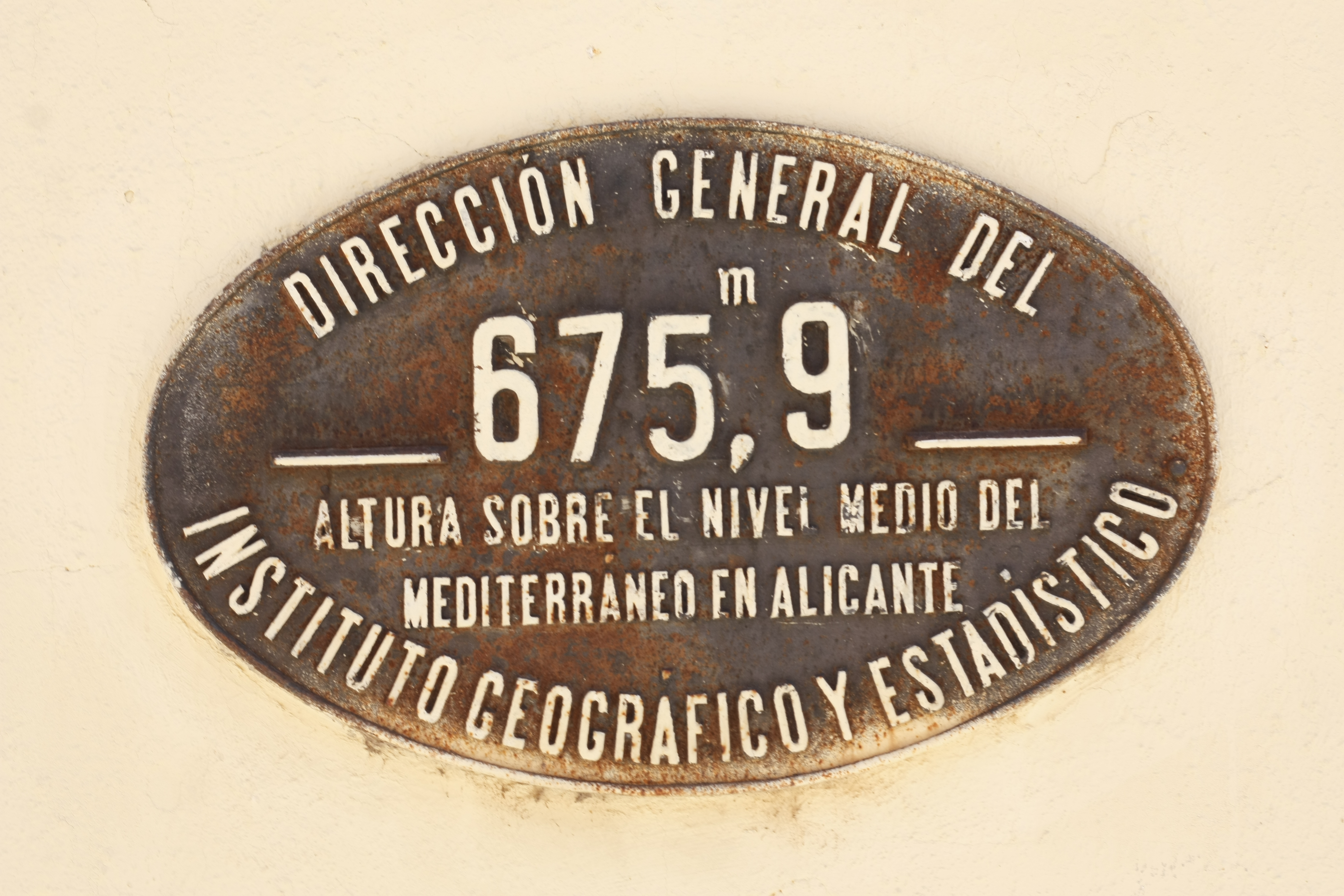
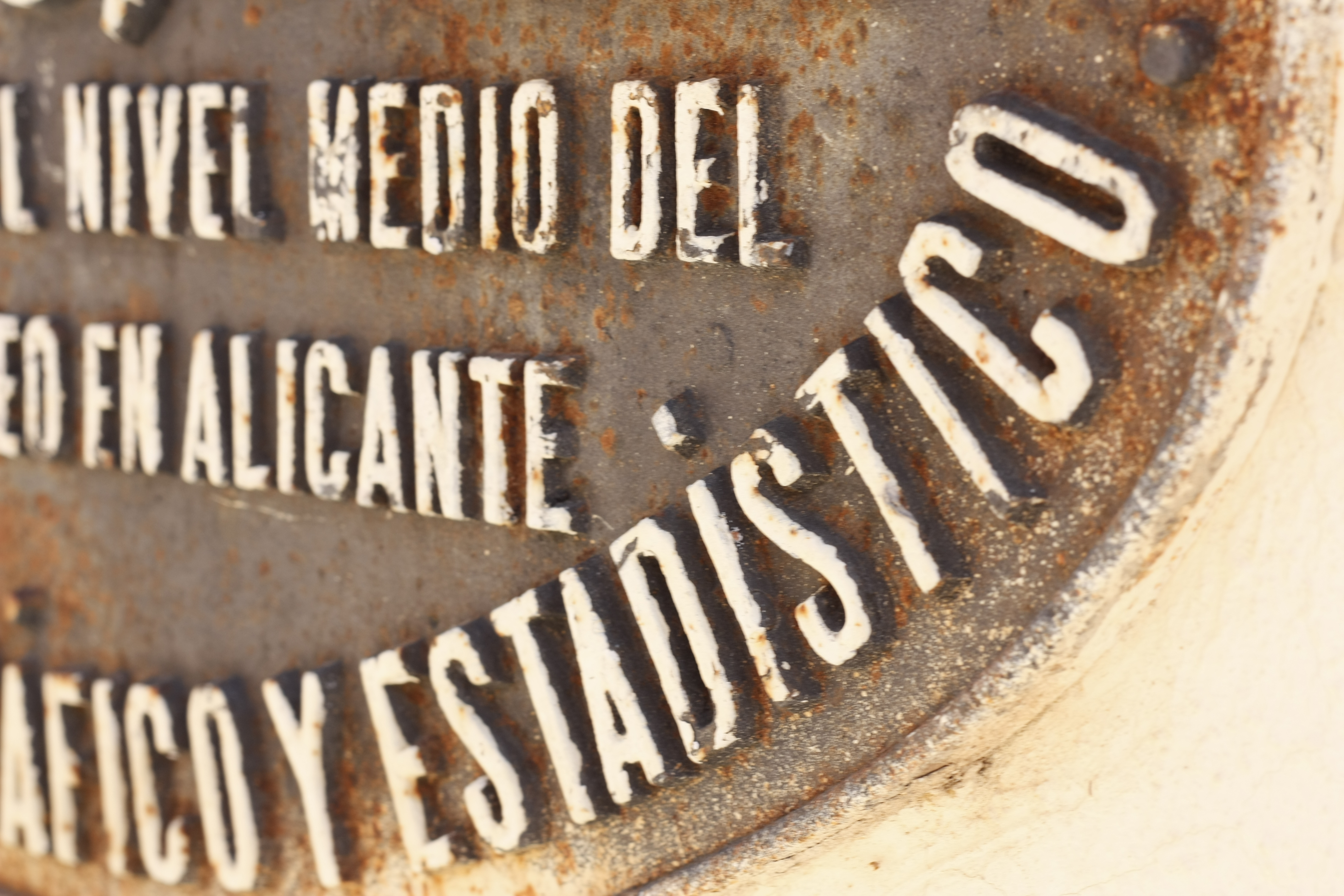
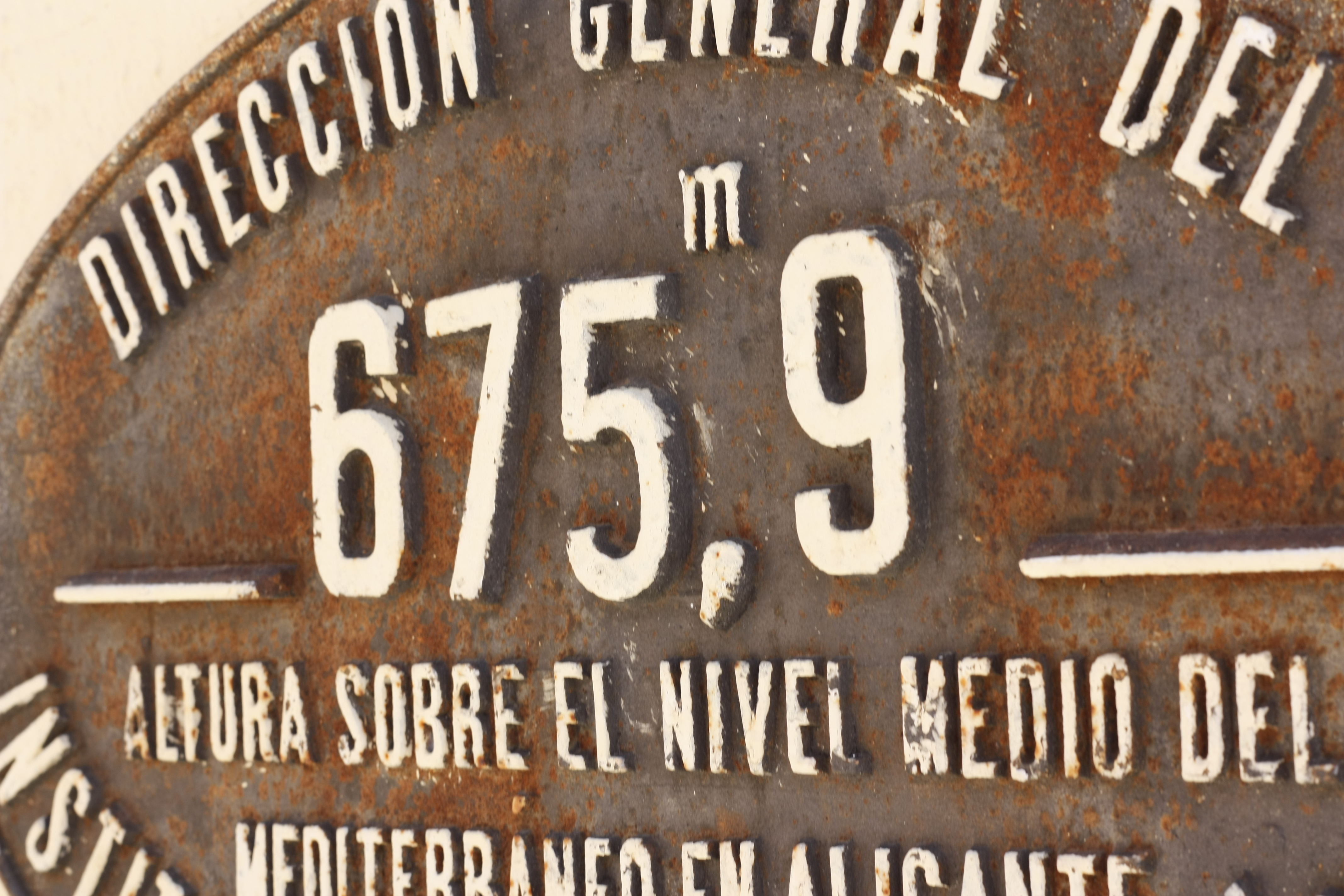
Cetina, Spain, taken in August 2014
This summer I was travelling by car from Madrid to Tarragona (road-trips are my favourite kind of vacation, my apologies for the non-environmental aspect). When I stopped in a remote town in Aragón I came across this sign. I could not but pull in the car to take a closer look.
This is one of the plaques of the Instituto Geográfico y Estadístico, that was created in Madrid in 1856 to elaborate an exhaustive topographic map of Spain. The plaque provided the height of that exact point in relation to the sea level in Alicante (Alicante was always used as a unit of measurement because of the small difference between tides). The project started in the mid nineteenth century and ended in 1966, by then there were 2150 signs all over Spain of which 428 were in railway stations.
The only reference to date the plaques is the inscription, if it reads Instituto Geográfico y Estadístico, they were put before 1925. In that year the organization changed its name to Instituto Geográfico y Catastral, so after 1925 the name in the plaques also changed.
To see my (small) album of plaques go here. All the information came from Jordi Olivé’s article [in Spanish].
Tags: public lettering, signs, institutional, lettering, cast iron, plaques, Spain.
Felbrigg Hall


Norfolk, April 2014
And last, but not least. The visit to Norfolk in April had a final and amazing surprise: Felbrigg Hall, one of the few examples of balustrade lettering that remains (or was ever made). All I can say it that I don’t think many people jumps when seeing certain works of lettering for the first time.
Although it is not Castle Ashby, the lettering on Felbrigg Hall is quite impressive. The house is one of those buildings that grew over the years starting in the mid–15th century, but the house as we know it now was built in the 17th-century, when the lettering Gloria ‘Deo in Excelsis’ was added. Since 1969 Felbrigg Hall has belonged to the National Trust property and it is a mandatory visit.
To see my pictures of Felbrigg Hall go here.
Tags: public lettering, institutional, lettering on balustrade, terracotta letters, check sans serif, Felbrig Hall, Norfolk, UK
— — — — — — — — · — — — — — — — —
In conclusion, 2014 has been a generous year in terms of trips and lettering. But the best
of all these pieces of lettering is that I shared those moments with my dearest friends. Without them none of this would have made any sense.
Merry Christmas and happy new year!
— — — — — — — — · — — — — — — — —
PS: Thanks to Julián Moncada and Phil Baines, for reading the original text and suggest some tweaking here and there and add some smart comments.
PS2: I want to thanks Catherine Dixon, who has taken me around England, showing me amazing places such as Felbrigg Hall in Norfolk and has, generously, share her knowledge and expertise.
PS3: The article has been translated to Spanish, edited by Manuel Sesma and published by Pedro Arilla in his blog Don Serifa, you can read it here.
GolumModerne (@GolumModerne)
December 24, 2014 @ 18:48
The link to your ‘(small) album of plaques’ seems to be broken
Elena Veguillas
December 27, 2014 @ 18:40
checked! thanks
Lo mejor del 2014… ¡en lettering! | Don Serifa, blog y podcast de tipografía
December 29, 2014 @ 11:36
[…] Veguillas. Más información en Invitados. Este artículo se publicó originalmente en inglés en el recomendable blog personal de la autora en diciembre de […]
Ten ‘lettering-moments’ of the year | 365typo
January 2, 2015 @ 17:46
[…] Elena Veguillas features a nice collection of lettering in UK and Spain on her blog Typography Studies. […]